Overhauling the registration page
Posted on Fri 24 July 2020 in conveyor
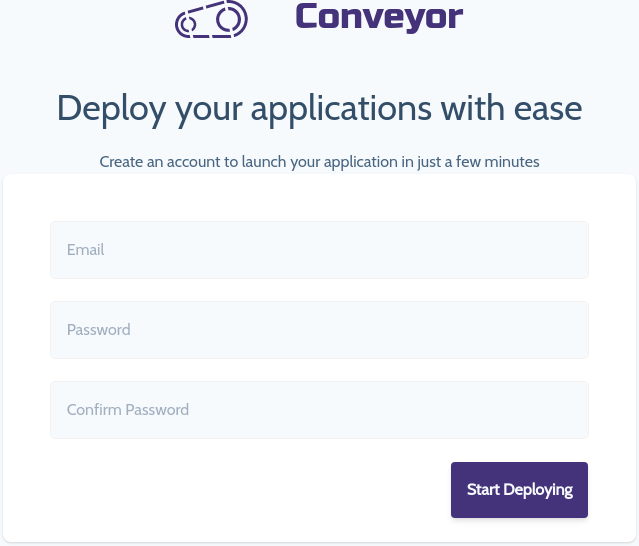
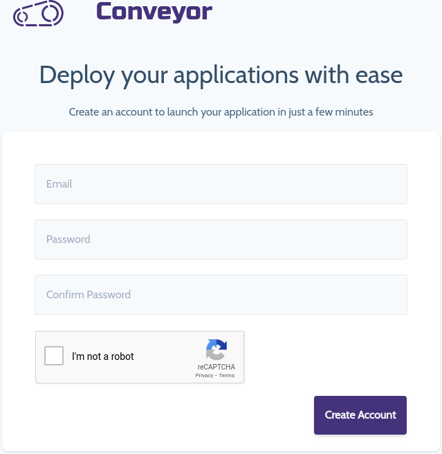
In this iteration a few small changes are going to be made. Here is the current state of the Conveyor registration page:
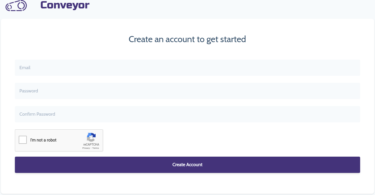
Here it is after the following changes:
- The width of the form imports are too long
- Add a referral code input
- Make the submit button smaller
- Right align the submit button
- Add copy for no credit card requirement
Iterations
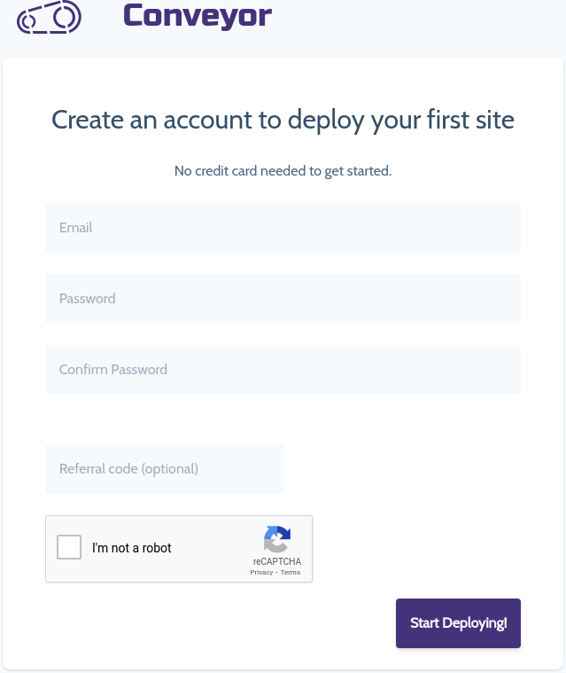
However, after seeing the finished product I did not like the referral code input on that page so it has been removed for now. Here were a few iterations of the page.
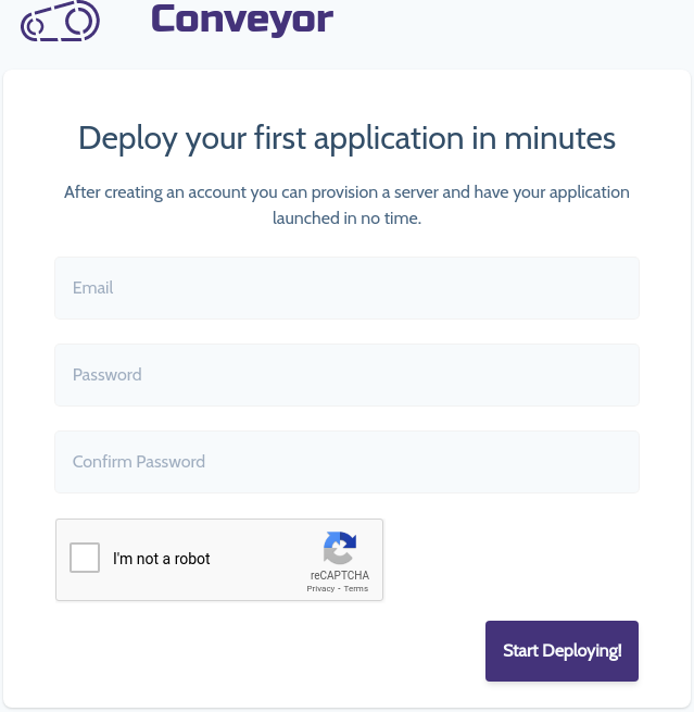
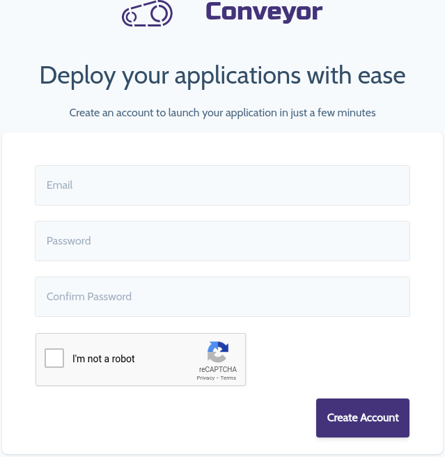
The final iteration in this round
To keep things looking clean, the captcha button has been removed and will now use the invisible recaptcha
